

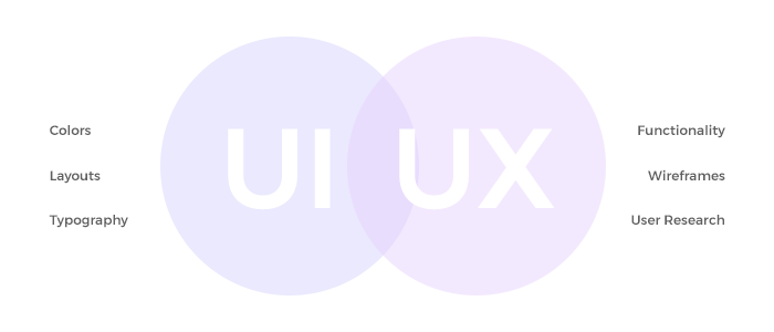
Smartly crafted User Interface/User Experience, commonly called UI/UX, is the most important thing for any website or app. If your pages aren’t easily navigable and aesthetically appealing, people won’t stay. Studies show that people decide whether or not they are going to stay on a site within the first few seconds of arriving. You want people to spend time and interact with your website. If it’s designed badly, people will close out of it in a heartbeat.
So you need to ask yourself: How accessible is my site, and how do I avoid bad UI/UX?
Simple fixes with enormous effect
I’ll share a story to help make my point here.
Our clients, Resurgens Orthopaedics, were having an issue with a form on their website designed to help patients find the right doctor. People would start the form, but not finish it. We ran some user experiments, and discovered that visitors were starting to fill out the questionnaire, but they were consistently falling off around Question 11. We gathered the data, and went to work.
We needed to figure out why users were abandoning the form when they reached Question 11.

Here’s what we found. A user’s ability to answer Question 11 was contingent upon their having answered Question 1 already. The problem was that they weren’t seeing Question 1. The question’s position on the page caused visitors to miss it, get frustrated and, as a result, abandon the questionnaire altogether.
The solution? We moved Question 1, and made it Question 10. With the two linked by proximity, users no longer had an issue fulfilling the prerequisite, and the conversion rate on the questionnaire spiked to 49.6%.
That issue was so simple, but it made a huge difference in UI/UX without any change to the actual content. Order, structure, color cues, motion, and more all factor into user experience on a page. When you’re ready to adjust these things, it can make an enormous difference.
The quest to optimize UI/UX
Don’t take this subheading to mean that there’s a formula for achieving an optimized state of UI/UX. There isn’t. Anyone who tells you they can design the perfect website “you’ll never have to adjust again” is full of it.
There are, however, a ton of resources available to help you determine what users are drawn to. You won’t predict it perfectly every time, like I said, but if you have the data, it’ll be that much easier to figure out what optimizations you need.
There is eye-tracking data, so you know where people look when they visit your site. There’s also heat-mapping, so you know what they click on. You have session replay to show you users clicking through your site in real time. There have been numerous debates about the optimal colors to use in order to maximize conversion rates.
The point is, use these things to your advantage, but don’t take them as guarantees of success.
Visitors will tell you how to improve
People’s needs are always changing, so your website has to be constantly evolving to stay relevant. It can’t take days off, and it can’t ever be off its game. At the same time, when you have an established system, you can alienate users with unnecessary changes, just as easily as you can with a mediocre user experience.
It doesn’t matter how smart you are; it’s impossible to predict user behavior with 100% accuracy. Whether you are just now building a site, or updating an existing one, the optimal state of your website should be dictated by the people who visit it. Don’t get oversold on perfect UI/UX when you first build your site. Do the best you can when planning, by all means! But be prepared to run A/B tests and make plenty of changes.
The last thing you want is a complicated, clunky site that you have trouble updating, and then have to pay someone to fix. You’re going to need the ability to optimize your site continuously as you learn more about your users, so approach the process right the first time.
Takeaways
If you take anything from this article, let it be this: When your site is hard to use, people leave and they never come back. That means your site has failed. One mistake can make or break UI/UX, and those are leads you are throwing away by not making the necessary adjustments.
There are products, apps, and sites that I want to use, but can’t or won’t because some aspect of their UI/UX prevents me. That’s crazy. There’s no reason why you should ever let your bad layout, or failure to address user complaints, lead to a loss of business.
There have even been times when I want to give feedback to an app I like, but can’t find a way to do it. I’m trying to do their research for them! How do you not let me, the user, help you make your UI/UX better? Sure, if you open yourself up to it, you’ll get some feedback that’s… less than helpful. But you’ll also get free information on how to make your business better.
Adjustments need to happen quickly and often. I can’t stress it enough. But you also need to walk a line between being reactive and over-reactive. Listen to the data, let it work for you, then adapt.
Remember, the public will tell you how to build great UI/UX. Just be sure to listen.


