I’m a ‘90s kid, which means I remember slap bracelets, Furbies, frosted tips, manually fast forwarding through commercials on my VHS player, and this AOL logo:
…and Beanie Babies, Wonderballs, Amanda, Please!, butterfly clips, my Lisa Frank lunchbox, Fresh Prince, Saved By The Bell, embroidered jeans, neon everything and “You’re watching Disney Channel.” I can keep going.
I also remember the first time my family ordered something off Ebay — and it came directly to our doorstep about a week later. Amazing.
Most of the novelties of my childhood have stayed in the ‘90s where they belong (goodbye, toe socks). But the movement toward ordering online isn’t going anywhere. 74% of Gen Z shoppers prefer online to brick and mortar. Millennials make over half of their purchases online. And 80% of Americans have purchased something online in the past month. Ecommerce is growing at a stunning rate.
To succeed in such a saturated market, you need a sound strategy. Because the competition is fierce. Users have seemingly endless choices online. There’s always somewhere else they can go. Did you know 38% of people say they’ll bounce immediately if they find your website’s layout unattractive? And 77% of users abandon their carts before checking out — perhaps because the checkout process is too complicated or cumbersome, you’re forcing your users to create an account, your site doesn’t look secure or your users discover hidden shipping costs.
#bye
The average ecommerce conversion rate is 1% – 2%. Which means for every 100 users who visit an ecommerce site, only 1 or 2 will actually become customers. But that’s on average. Your site can do better than that! And this is where CRO comes in.
Conversion Rate Optimization (CRO) is a set of methods used to increase the percentage of users on your website who convert.
“Conversions” in ecommerce could mean:
- Purchases
- “Add to cart” clicks
- “Add to wishlist” clicks
- Subscribing to a newsletter
Let’s take a step back and think about your overall business goals. What do you need to be successful in ecommerce? Sales. So let’s focus on driving sales. There are many ways to drive sales — the most popular are paid search, ads, social, email and SEO. Each of these channels drives traffic to your site. That’s great. But it’s not enough unless they also convert.
Regardless of how you get traffic to your site (ideally a mix of paid and organic channels) you should always include CRO in your strategy. Because CRO aims to get traffic already on your site to convert. And the traffic on your site has the most potential: users are usually lower-funnel and have higher purchase intent than those seeing your brand somewhere else on the internet.
Convinced you need CRO yet? Let’s jump into it.
Here are some CRO things you should already be doing:
Include reviews
Not just any reviews. Go for detailed, product-specific ones. It’s also a best practice to include a 5-star rating visual – if you don’t have one, no lying, you’ll lose the trust of some customers.
Showcase trust points
Depending on your product and target audience, these can include media mentions, influencer endorsements, or industry awards.
Use detailed product descriptions
They should include all specs that users may be interested in. And they should be clear, succinct, and consistent with your brand voice.


This product description for Patagonia’s Women’s Better Sweater includes detailed specs and measurements, information about the material and how the sweater is made, as well as size info about the model for reference. The “read more” design keeps the product page and description streamlined.
Offer live chat, especially for complex products
92% of online customers say they are satisfied by live chat features (compared to satisfaction rates of 85% for email customer service, 84% for facebook messaging customer service and 77% Twitter customer service).
Capture email

Gotta catch ‘em all! All of the emails, that is. There are many ways to do this: at checkout, with a discount code popup, subscribe box, through survey submissions or a popup activated by exit intent, for example.
Include videos where you can
There are all kinds of creative ways to do this! Patagonia, for example, includes videos of retail associates talking about their clothes along with traditional static images. Other brands include videos of models styling them.

Cross sell with “customers also bought…” features
Cross selling is responsible for 10-30% of ecommerce sales!
Use discount codes
Shopify shared a stat last year that shop owners actively using discount codes are 8x more likely to make a sale.
Offer free shipping
With cart abandonment rates higher than the Radio Head in the summer of ‘97, the last thing you want to do is annoy a potential customer right before they’re about to make a purchase.
Allow guest checkout
And remember to capture their email.
Offer a streamlined checkout with a progress bar
A progress bar will help reduce cart abandons.
Track cart abandons and retarget
Visitors who abandoned their carts but are retargeted with a display ad are 70% more likely to convert. This is amazing in terms of ecommerce conversion rate optimization.
Already doing everything on this list?

Time to level up to some more sophisticated analytics and testing opportunities.
First, some analytics tools:
Scrollmap

- What’s a scrollmap? A scrollmap is a type of heatmap that tracks how far users are scrolling on a page. You can set up scrollmaps for various pages of your site, and also mobile, tablet and desktop specific ones.
- What you’re looking for: You’re looking to see how far users scroll. If you notice a lot of users dropping off at a particular place on the page, you may hypothesize that the content you’re showing at that point is not engaging or doesn’t align with what your users are looking for. Then, you can test alternative content. You should also look for any discrepancies between desktop and mobile scrollmaps, as this can give you insight into how desktop and mobile users are using your site differently. Also, take a look at how far users are scrolling. if your “buy now” button is lower on the page than a high percentage of where users scroll, you should move it higher.
Clickmap

- What’s a clickmap? A clickmap is a hype of heatmap that tracks where users click. It’s a great way to visually understand which places on the page are enticing users to click. This type of data is super helpful when you’re trying to increase conversion rates for ecommerce.
- What you’re looking for: Take note of any places where users are clicking that are not conversion-focused CTAs. This may indicate areas where you can build out content to push users down the funnel, or areas of prime real estate that should be used for a different, conversion-focused CTA. Also note areas where users aren’t clicking but you want them to. This can spark ideas for testing.
Analytics
There are all kinds of reports in Google Analytics. Here are a few of our faves for CRO.
1. Landing Pages
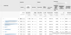
- How to get there: Behavior → Site Content → Landing Pages
- What you’re looking for: This report is useful for seeing where users land on your site, and how they engage with the page they’ve landed on (and the site in general.) Specifically, look for these things in the Landing Pages report:
- Pages that have a high bounce rate: a high bounce rate could indicate that the content on this landing page isn’t resonating with users. It may be too much info, not enough, or not the right content — meaning it could be higher or lower in the funnel or simply not what users are looking for.
- Pages with a high session duration: A high session duration generally indicates that the landing page was engaging enough to encourage a user to stick around. Study the elements of the page to see what you can glean — and what you could test on other landing pages.
- Pages that have a high conversion rate: If a specific landing page has a high ecommerce conversion rate, study it. What is unique about it? Does it have a lot of CTA’s? Is it short form or long form? Is the content specific or general? What kinds of visuals, multimedia and trust points are on the page? Note these elements, as you should test them on other landing pages.
- Pages with a low conversion rate: A landing page with a low conversion rate is especially alarming when its a specific, lower-funnel landing page or when it’s a page that gets a lot of traffic. Take note and build out some tests to identify how you can better serve users.
- Pages that get a lot of sessions: When you have a lot of landing pages where you can run tests, prioritize those with the most sessions.
2. Source / Medium

- How to get there: Acquisition → All Traffic → Source Medium + add secondary dimension “Landing page”
- What you’re looking for: This report is useful for seeing where users come from and how they interact with a site. We like to add landing page as a secondary dimension, like I’ve shown above. This allows us to study how users from various sources engage with particular landing pages. These are some specific things we like to take note of in the Source Medium report:
- Source Medium / Landing Page pairs with High Bounce Rates: This could indicate that a landing page is not resonating for a particular group of users. The content could be misaligned with what they’re looking for, or the design could be making it hard for users to find what they need easily.
- Source Medium / Landing Page pairs with Low Conversion Rates: Again, this could indicate that users are not finding what they’re looking for, or that you’re not presenting the content in a way that leads them to convert.
- Source Medium / Landing Page pairs with High Conversion Rates: Take note of sources and landing pages that have high e-commerce conversion rates and see what you can learn. Are those landing pages long? Short? Detailed? Do they contain multimedia? What kinds of CTA’s do they have?
3. Behavior flow

- How to get there: Behavior → Behavior Flow
- What you’re looking for: This report shows you how users navigate through your site. As you study the report, ask yourself:
- What are the most popular paths users take? Are they leading to conversions?
- Are users going straight to checkout or viewing multiple product pages?
- Note: you can also filter for new vs. returning users and frequency vs. recency.
Based on the data you find, build out some testing ideas. Here are some good ones for ecommerce to get you started:
- Multi-step vs one-step checkout style
- Price points
- Sticky vs fixed navigation
- Number of items in the navigation
- Short vs long landing pages
- Button colors
- Button copy
- Header copy
- Static vs scrolling hero
- Imagery style: people vs products
- Orientation of photos
- Video thumbnails
- Fonts and typography
- Popup styles
- Discount/promo codes
Depending on the complexity of your tests and how many variables you want to isolate, here are some testing styles to choose from:
AB test
- What is an AB test? AB testing compares two versions of a webpage, A and B, to see which one performs better. Performance is defined by KPIs like conversions and bounce rates.
- When to use this type of test: To isolate one variable — for example, testing one color CTA button against another.
ABn test
- What is an ABn test? A spinoff of an AB test, ABn testing simply adds another variable, so you test variations A, B, C, D etc against the original.
- When to use this type of test: When testing two or more variations of the same element &mdash for example, three versions of hero copy.
Split (multivariate) test
- What is a split test? A split test (also called a multivariate tests) tests two entirely different pages against each other, as opposed to one simple element being changed. The variation page will contain many different elements than the first.
- When to use this type of test: For more complicated tests with many variables (like a short form vs long form landing page). Split testing is high impact but with less precision — you won’t know which particular change caused a lift or dip in ecommerce conversions, but you can figure this out later with isolation tests.
Two quick notes as you’re testing:
First, remember that failure is an essential part of success when it comes to CRO experimentation. Read about How to Fail Well with CRO here.
Also remember to consider mobile. If your site gets more mobile than desktop traffic, start with mobile testing first. At Brain Bytes Creative, we often run mobile-specific and desktop-specific tests. You can read more about Mobile-first CRO testing here.
I hope this guide has been helpful and has given you some tools to increase your e-commerce conversion rates.
Time to set these testing ideas in action and get some actionable results.
Thanks for reading!